
You walk into a friend’s house and immediately think, “This place looks spotless.” Then you walk into another home and something feels off, even though you can’t spot actual dirt. The difference? Often, it’s not about how much cleaning happened. It’s about color.
The best colors for a clean looking home aren’t what most people expect. Bright white walls don’t automatically translate to a fresh appearance. Dark colors don’t always look dingy. The truth is more interesting than that. Color creates a perception of cleanliness that either works with reality or fights against it. When you choose the right house paint color, your home reads as clean even between deep cleaning sessions. When you choose wrong, you’re fighting an uphill battle every single day.
Let me show you which colors actually deliver that always-clean impression and why they work.

Here’s something that surprises most people: bright white shows everything. Every scuff mark. Every handprint. Every shadow where furniture used to sit. It reads as “just been painted” when it’s perfect and “grubby” the moment it’s not.
The reason comes down to contrast. Pure white creates maximum contrast with any imperfection. A tiny smudge that would disappear against an off-white becomes a glaring spot against stark white. Your eye is drawn to the flaw, not the cleanliness.
Off-white and warm white paints have enough depth to absorb minor variations in light and wear. Think Benjamin Moore White Dove or Farrow & Ball Wimborne White. These interior paint colors have a slight warmth that reads as intentional rather than dingy.
- Stark white (pure white with cool undertone) works in galleries and hospitals, not in homes where people actually live. It reads clinical rather than clean.
- Off-white with a very slight yellow or cream undertone photographs brighter than it appears in person. It scans as clean even under imperfect lighting conditions.
- Walls with warm undertones hide the slight color shifts that happen throughout the day as natural light changes. Cool whites amplify those shifts.
- The finish matters as much as the color. Matte finishes hide surface imperfections beautifully. Eggshell is easier to wipe down when you need to. Neither is right for every room.
The cleanest-looking white isn’t white at all. It’s the warmest off-white you can use before it starts reading as cream. That’s your sweet spot for crisp white paint shades that actually stay looking fresh.
Reducing visual clutter works hand-in-hand with color choice. The right neutral color palettes create a calm backdrop that makes the overall impression of your home feel ordered and clean.
The Best Colors for a Clean Looking Home in Main Living Areas

Your main living area is where color choice has the biggest visible impact. This is the space guests see first. Where you spend most of your waking hours. Where lighting changes dramatically from morning to evening.
Warm greige consistently wins as the most forgiving neutral in open-plan spaces. It’s a grey and beige mix that reads as both warm and clean across changing light conditions. Unlike pure grey (which can look cold) or pure beige (which can look dated), greige gives you the best of both.
Soft stone tones are the current equivalent of what cream was a decade ago. Barely-there stone grey. Pale putty. These fresh wall colors feel grounded and modern without trying too hard. They’re hard to get wrong.
- Mid-tone walls in living areas hide daily wear better than very light or very dark options. Scuffs from furniture. Rub marks where people lean against walls. The subtle shadows that develop around light switches.
- Avoid cool greys with strong blue undertones in rooms with little natural light. They read as cold and dirty rather than clean and calm. The lack of warmth makes the space feel unwelcoming.
- Paint the ceiling one to two shades lighter than the walls, not white. This unifies the room and lifts the space without the harsh contrast of white ceilings.
- Consistent color across connecting spaces creates flow. When your living room, dining area, and hallway share the same base tone, the home feels larger and more cohesive.
The principle here: you want colors that read as intentional, not as “we haven’t painted in years.” Warm neutrals with enough depth to hide minor imperfections will always look cleaner than stark whites or cool greys that show everything.
Kitchen and Bathroom Colors That Stay Looking Fresh

Kitchens and bathrooms need colors that hold up to steam, splashes, and regular cleaning. The best choices here aren’t necessarily the same as for living areas. These rooms have different lighting, different moisture levels, and different cleaning requirements.
Soft white cabinetry remains the cleanest-reading choice in kitchens. Not bright white (which shows every fingerprint). Slightly warm whites that age gracefully against countertops and backsplashes. They maintain that fresh feeling without the clinical harshness.
Pale sage and soft clay are gaining ground as kitchen colors. They read as fresh because they reference nature rather than sterile cleanliness. A pale sage cabinet paired with white walls gives you visual interest without sacrificing that clean impression.
- In bathrooms, very pale blue-greens and soft stone tones align with water and cleanliness psychologically. This is one case where a cool undertone works in your favor. The association with water makes these colors feel inherently clean.
- Avoid dark cabinetry in small kitchens with limited natural light. It reads as enclosed and dingy regardless of how clean it actually is. Save dark colors for large kitchens with excellent natural light.
- Grout color matters as much as tile color. Mid-tone grey grout hides staining far better than white grout, which starts looking dingy within months.
- Glossy or semi-gloss finishes in kitchens and bathrooms aren’t just practical for wiping down. They reflect light, which amplifies that clean, fresh feeling.
Think about keeping your entryway clean and how that first impression carries through to other spaces. Color choices at transition points affect the overall perception of your home. A muddy beige in the hallway undermines the beautiful soft white in your kitchen.
Bedroom Colors That Feel Clean and Calm

Bedrooms need to balance two things: looking clean and feeling restful. Some colors achieve both. Others sacrifice one for the other.
Pale blue-grey is the minimalist home color that consistently delivers in bedrooms. It’s cool enough to feel calm but warm enough not to read as cold. It works across different lighting conditions and pairs beautifully with white bedding.
Soft blush tones are another option that surprises people. A very pale pink with grey undertones reads as sophisticated rather than childish. It brings warmth without the yellow undertones that can look dingy in low-light bedrooms.
- Very pale greens (think barely-there sage or soft eucalyptus) create that spa-like feeling people want in primary bedrooms. They reference nature without being bold.
- Avoid medium-tone colors in bedrooms. They’re too bold to feel restful and not bold enough to feel intentional. You end up in an awkward middle ground that doesn’t deliver either goal.
- White or very pale bedding amplifies whatever wall color you choose. If your walls read as even slightly dingy, white bedding will make it obvious.
- Blackout curtains or shades in a color that matches your walls create a seamless look. Mismatched window treatments break up the clean lines you’re trying to create.
The bedroom is where you can lean slightly cooler with your color choices. The room is used primarily in low-light conditions (morning and evening), so you don’t have the harsh midday light that makes cool tones look dingy in living areas.
Dark Colors That Actually Look Clean

Here’s where it gets interesting. Dark colors can look cleaner than light colors in certain contexts. The key is understanding when and where they work.
Deep charcoal and navy blue hide imperfections that would show up immediately on light walls. Scuffs, scratches, and minor stains disappear into the depth of the color. In high-traffic areas like hallways or mudrooms, this is a massive advantage.
Dark colors also create the perception of intentional design rather than “we’re trying to hide dirt.” When you paint a dining room navy or a powder room charcoal, it reads as a deliberate choice. That confidence translates to a polished, clean impression.
- Dark walls work best with white or very light trim. The contrast creates clean lines that feel crisp and intentional.
- You need excellent lighting to pull off dark walls. Poor lighting makes dark colors feel dingy and enclosed. Good lighting makes them feel sophisticated.
- Dark colors show dust more readily than mid-tones. This sounds counterintuitive, but it’s true. You’ll need to dust regularly, but you won’t see scuffs and marks the way you would on lighter walls.
- Limit dark colors to rooms with specific purposes. A dark library or dining room feels intentional. Dark walls throughout an entire home feel heavy.
The principle: dark colors work when they’re part of a high-contrast scheme with plenty of light. They fail when they’re used to “hide dirt” in poorly lit spaces. That approach backfires every time.
What Color Does to the Perception of Cleanliness — And What It Can’t Fix
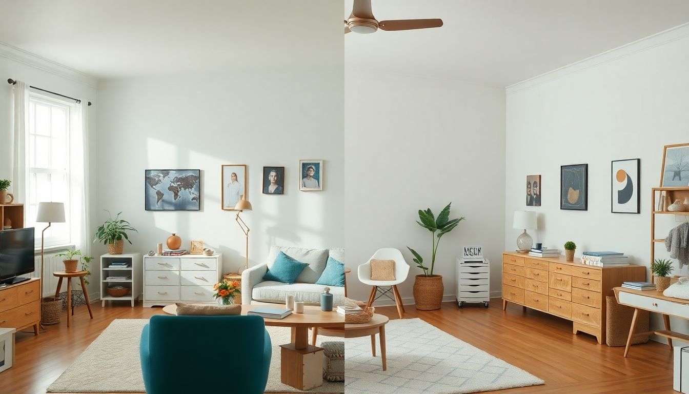
Let’s be honest about what color can and can’t do. A perfectly chosen neutral on a wall covered in mismatched frames and cluttered surfaces still reads as chaotic. Color helps, but it doesn’t override clutter, poor lighting, or visual noise.
Color is the amplifier. It makes a tidy room look tidier and a cluttered room look more noticeably cluttered. When you pair the right house paint color with actual organization and cleanliness, you get that “always looks clean” effect. When you use color to try to hide mess, it doesn’t work.
- Consistent color across textiles, storage, and surfaces matters as much as the wall color. A beautiful greige wall loses impact when paired with mismatched throw pillows, random storage bins, and clashing furniture finishes.
- Light colors near entryways and transition zones reveal tracked-in dirt faster. That’s not necessarily bad. It keeps you honest about maintenance. But if you want to minimize visible dirt, consider how to avoid tracking dirt into the house in the first place.
- Poor lighting makes any color look dingy. Before you repaint, evaluate your lighting. Add lamps. Replace dim bulbs. Open curtains during the day. Color can’t compensate for inadequate light.
- Visual clutter (too many small objects, busy patterns, competing colors) overwhelms even the best paint choice. Simplify first, then choose your color.
The best approach combines smart color choices with actual cleanliness and organization. Neither works as well alone as they do together.
Choosing Your Clean-Looking Color Palette
[Image: Color palette card showing coordinated paint swatches in warm whites, soft greys, and one accent color, arranged on a clean white surface]
You don’t need a different color in every room. In fact, limiting your palette to two or three main colors creates that cohesive, clean impression better than a rainbow of options.
Start with one main neutral for most walls. Add a slightly lighter version for ceilings. Choose one accent color for specific rooms or features. That’s your whole-house palette.
- Test paint samples in the actual rooms where you’ll use them. Paint large swatches (at least two feet by two feet) directly on the wall. Live with them for several days before deciding.
- View your samples at different times of day. Morning light, afternoon light, and evening artificial light all change how colors appear. What looks perfect at noon might look dingy at 7 PM.
- Compare samples to pure white paper to identify undertones. If your “white” looks yellow next to copy paper, it has warm undertones. If it looks blue or grey, it has cool undertones.
- Buy the best paint you can afford. Premium paint with better coverage and durability maintains that fresh appearance longer than cheap paint that requires multiple coats and shows wear quickly.
The goal isn’t perfection. It’s choosing colors that work with your lifestyle and lighting to create a home that reads as clean and feels welcoming. That’s more valuable than any specific shade name.
The Bottom Line on Clean-Looking Colors
The best colors for a clean looking home aren’t about following trends or copying what you see in magazines. They’re about understanding how color, light, and perception work together in your specific space.
Warm off-whites beat stark white. Mid-tone neutrals hide more wear than very light colors. Dark colors work when paired with excellent lighting and white trim. And no color choice can overcome clutter and poor maintenance.
Choose colors with warm or neutral undertones for main living areas. Consider slightly cooler tones for bathrooms where the association with water enhances the clean feeling. Limit your palette to create cohesion. Test thoroughly before committing.
Your home will look cleaner when the colors you choose align with reality rather than fighting against it. That’s the real insight here. Not which specific shade to buy, but understanding that “clean-looking” is about perception, maintenance, and smart choices working together.
Start with one room. Choose a color that makes sense for the lighting and use. Live with it. Then expand from there. You’ll develop an eye for what works in your home, and that’s worth more than any color recommendation I could give you.


