
90s colors are back. Mauve, dusty sage, warm yellow, dusty purple. The tones that defined a decade of interior design have been reappearing in paint ranges, fabric collections, and interiors across the board. The more useful question is not whether they are back. It is which ones are actually worth revisiting, and why they read so differently now than they did the first time around.

The 90s color palette gets dismissed as a mistake the decade eventually grew out of. That is not entirely fair.
The muted, dusty quality of those tones was doing something real. Mauve, dusty sage, and warm taupe were all reaching toward a warmth that the stark white interiors of the 2010s deliberately moved away from.
The problem was never the colors themselves.
It was the materials they were paired with. Synthetic fabrics, flat finishes, furniture that had not yet caught up to what the palette was trying to be. Now the materials have caught up. Natural linen, textured plaster, handmade ceramics, raw timber. These are the surfaces that 90s colors were always waiting for.
That is why the revival does not read as nostalgia. It reads as a palette finally arriving in the right room.
Mauve: The One That Aged Best
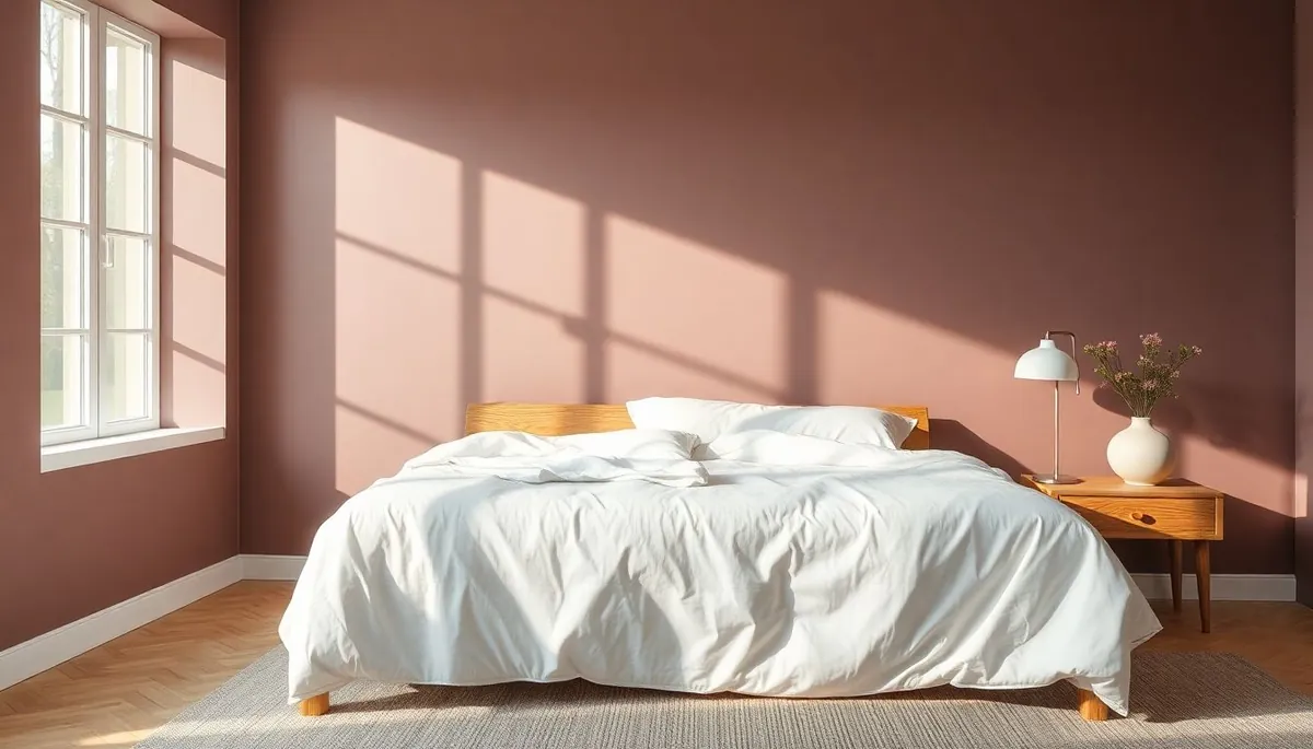
Mauve is the standout of the revival, and for good reason.
It sits between pink and purple with enough gray in it to read as sophisticated rather than sweet. In the 90s, it often appeared in glossy finishes alongside hunter green or burgundy, which dated it quickly. In a current interior, in a flat or matte finish against natural wood and linen, it reads almost as a neutral.
The key is how much gray the mauve carries.
Versions that lean too pink tip toward nursery territory. Versions with more gray and a slight purple undertone sit closer to the blush tones that have been gaining consistent traction in interiors over the past two years. Benjamin Moore’s Pale Mauve and Farrow and Ball’s Sulking Room Pink are both in this range, registering differently depending on natural light.
Mauve works hardest in bedrooms and living rooms where warmth is the goal. It also layers particularly well with color drenching, painting trim and ceiling in the same or an adjacent tone, which gives it a contemporary application that has nothing retro about it.
Dusty Sage: The Safe Choice (Which Is Not a Criticism)
Dusty sage has been in steady rotation long enough that calling it a 90s revival feels slightly generous. It never fully left.
What has changed is how it is being used.
In its original context, sage tended to appear on kitchen cabinets and bathroom tiles, often in a slightly dull, low-saturation version that sat closer to gray than green. The current iteration is warmer and more botanical. Think green with a soft earthy undertone rather than green with a gray one.
The difference between dated sage and current sage is almost always the undertone.
Cool-gray sage belongs in the past. Warm, clay-tinged sage, the kind that looks alive in natural light, is what is actually working in interiors right now. Sherwin-Williams’ Privilege Green and Benjamin Moore’s Hampshire Rocks are both in this territory. Neither will look like a throwback in five years.
Sage pairs naturally with warm whites, raw timber, terracotta, and boucle. It is forgiving in rooms with variable natural light, which is part of why it has stayed relevant for as long as it has.
Warm Yellow: Confidence Required

Warm yellow is the 90s revival color that requires the most conviction to use well.
Done without care, it tips into retro kitsch fast. Done with intention, it brings a generosity and warmth to a room that almost no other color can match.
The distinction between 90s yellow and current yellow is saturation.
The decade’s original yellows were often too saturated, too close to primary. The current versions sit in a mustard or warm ochre register, with enough brown in them to feel grounded rather than bright. Cole and Son’s Churlish Green adjacent warm yellows, Farrow and Ball’s Babouche, and Benjamin Moore’s Hawthorne Yellow are all in this range.
Yellow works best as a feature wall or in a room with strong natural light. In a darker room, it can read as heavy.
It is also one of the colors most responsive to the dopamine decorating principle: the idea that color choices should generate a genuine emotional response in the people living with them. If a warm yellow wall makes you happy every time you see it, that is a design success regardless of what any trend report says. The dopamine decor approach explains this thinking in full.
Dusty Purple: The Most Underrated One
Dusty purple is the quiet surprise of the revival.
It barely registers as a trend yet, which is part of what makes it interesting. The versions worth paying attention to sit in a muted, slightly grayed lavender territory, closer to a dusty lilac than to a bold violet. Farrow and Ball’s Brassica and Little Greene’s Thistle are both approaching this from different directions.
In its 90s incarnation, purple in interiors tended to be either too saturated or too sweet, which is why it dated so badly.
The current dusty versions avoid both problems. They carry enough gray to read as sophisticated and enough warmth to avoid feeling cold. In a bedroom or a reading corner, a dusty purple wall creates exactly the kind of enveloping, restful atmosphere that moody interior design has been building toward for the past few years. It is a natural next step for anyone who has been curious about deeper, more atmospheric color but has not been ready to commit to a full dark room.
Pair it with warm brass hardware, natural linen, and wood tones that lean toward honey or walnut. Avoid cool metals and stark white, which will flatten it.
How to Bring These Colors In Without the Room Looking Like a Time Capsule
The difference between a 90s throwback and a 90s revival comes down to three things: finish, material, and restraint.
Finish first. Flat and matte finishes read as current. Satin and gloss on walls read as dated. If any of these colors are going on your walls, choose the flattest finish the room’s traffic level will allow.
Material second. These colors need natural, textured surfaces around them to land correctly. Linen, raw cotton, handmade ceramics, solid timber, jute, and plaster all work. Smooth synthetics, lacquered surfaces, and mass-produced objects in the same color family will drag the palette back toward the decade it came from.
Restraint third. One 90s revival color per room is a considered choice. Two is a conversation. Three is a theme party. Pick the shade that genuinely appeals to you and let it be the room’s starting point rather than one of five competing statements.
One thing worth noting for anyone working with bolder wall colors: richer, more saturated tones show dust, fingerprints, and scuffs more visibly than neutral walls do. A recurring professional clean keeps color-drenched walls and textured surfaces looking the way they are supposed to, before the buildup starts to dull what the color was doing.
The Shades Worth Skipping
Not every 90s color deserves a second run.
Cool beige with pink undertones, the shade that appeared on every suburban wall for a decade, has not earned a comeback yet. Neither have the heavily saturated teals and forest greens that appeared in 90s bathrooms. They read as period-specific in a way that the softer, dustier tones do not.
The colors worth revisiting are the ones with enough complexity to work in multiple lighting conditions and against modern materials. Dusty, muted, warm, and slightly grayed. That is the thread that connects every revival shade worth paying attention to.
If a 90s color needs the original furniture to make sense, it is not ready to come back. If it works in a room full of linen and solid timber, it has genuinely earned its revival.
This Is Not About Nostalgia
The appeal of 90s colors is not really about the decade they came from.
It is about warmth. After years of white walls, gray floors, and cool-toned minimalism, these dusty, imperfect, slightly faded tones feel like relief. They make rooms feel inhabited rather than staged. They bring a quality of light that stark neutrals simply cannot replicate.
The decade’s design instincts were not wrong. They were just waiting for the right moment, and the right materials, to finally make their case.


